settings
このページに書いた
code:style.css はすべてのユーザーに適用される。いろいろ
Scrapboxアイコンを小さくする
style.css .brand-icon {
 	width: 20px;
     height: 20px;
  }
ページ一覧のグリッド表示
隙間を狭くする
style.css .page-list .grid li {
 	margin: 0.2em;
 }
サムネイル表示の余白を減らす
inheritのかわりにinitialでもいいかもれない
style.css.grid li.page-list-item a .description {
    line-height:1em;
    padding: inherit;
}
.grid li.page-list-item a .header {
	padding: inherit;
	border: inherit;
}
.grid li.page-list-item a .content {
	padding: inherit;
}
引用の中の画像の最大サイズを制限して影を付ける
style.cssspan.quote img {
 	box-shadow: 3px 3px 5px 0 rgba(0, 0, 0, 0.3);
	object-fit: scale-down;
	width: 40em;
	height: 10em;
}
行の高さが高すぎる気がするので
style.cssdiv#editor.editor {
	line-height: inherit;
}style.css.line span.code-block {
line-height: inherit;
}ユーザー名と一致するタイトルのページの
code:style.css は当該ユーザーにだけ適用されるTakashiSasakiというページの
code:style.css はTakashiSasakiが表示した場合にだけ適用される一部の
code:style.css を適用したくない場合は code:-style.css のようにすると良いだろうカーソル行ハイライト
なぜか
@import しても機能しなかったのでそのままコピペさせていただきました。どうやら/tech-notes/settingsでの
@import はできないみたい。ユーザーページ/tech-notes/TakashiSasakiでの
@import は機能するようだ。style--.css.cursor-line {
background-color: rgba(0, 0, 0, .02);
box-shadow: inset 0 -5px 5px -5px rgba(0, 0, 0, .3);
}画像の表示サイズを調整する
-style.css/* Scrapbox内に保存された画像の場合 */
strong.level span.modal-image svg.image { width: 16.7vw; max-height: none; }
strong.level-1 span.modal-image svg.image { width: 16.7vw; max-height: none; }
strong.level-2 span.modal-image svg.image { width: 33.3vw; max-height: none; }
strong.level-3 span.modal-image svg.image { width: 50%; max-height: none; }
strong.level-5 span.modal-image svg.image { width: 83.3vw; max-height: none; }
strong.level-4 span.modal-image svg.image { width: 66.7vw; max-height: none; }
strong.level-6 span.modal-image svg.image { width: 100vw; max-height: none; }
/* 外部の画像の場合 */
strong.level span.modal-image img.image { width: 16.7vw; max-height: none; }
strong.level-1 span.modal-image img.image { width: 16.7vw; max-height: none; }
strong.level-2 span.modal-image img.image { width: 33.3vw; max-height: none; }
strong.level-3 span.modal-image img.image { width: 50vw; max-height: none; }
strong.level-4 span.modal-image img.image { width: 66.7vw; max-height: none; }
strong.level-5 span.modal-image img.image { width: 83.3vw; max-height: none; }
strong.level-6 span.modal-image img.image { width: 100vw; max-height: none; }
引用の中ではすべて小さく表示にしたい。
style--.cssspan.quote span.modal-image .image {
  max-width: 10em;
  max-height: 5em;
  margin-left:0em;
  margin-right:0.5em;
}
引用行内でテキストを回り込ませる
引用内では画像を左に配置してそれ以外の要素を画像の右側に回り込ませる。
調整中のため一時的に無効にしてあります。
hogehoge-style.css .line .quote {
display: inline-flex;
flex-direction: row;
flex-wrap: wrap;
align-content: flex-start;
justify-content: flex-start;
align-items: flex-start;
}
.line .quote span {
flex-basis: auto;
flex-grow: 0.5;
flex-shrink: 1;
}
.line .quote span.tag {
display: none;
}
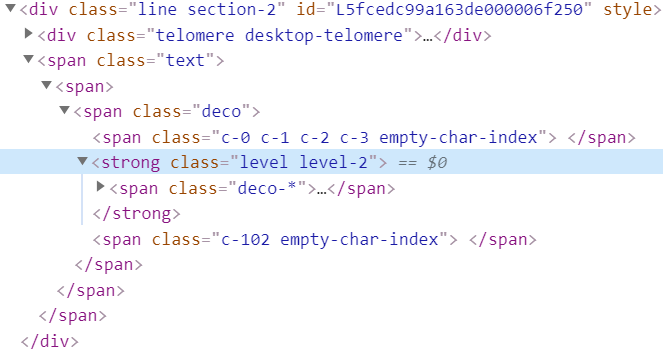
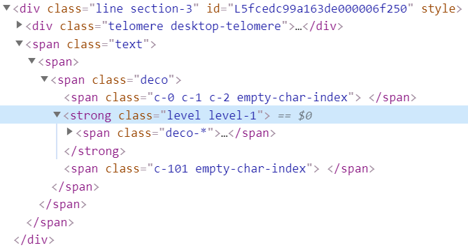
/* span.quote span.modal-image { float:left; }*/ level-1は無意味
なぜか
level-1 だけサイズの調整が効かない。セレクタが間違っているわけではなさそう。
そもそもapp.cssに
level-1 が出力されていない。>
Scrapboxの外に置かれた画像ファイルへのリンク
>外部に置かれた画像は
span.modal-image a img.imageのようになる。この場合は画像のサイズを調整するためにimg要素のサイズを調整する。

Gyazoにアップロードされた画像
>
Gyazoにアップロードされた画像も外部のサイトに置かれた画像と同じ扱い。
Scrapboxにアップロードされた画像
>Scrapboxにアップロードされた画像は
span.modal-image a svg.image foreignObject imgのようになる。この場合は画像のサイズを調整するためにsvg要素のサイズを変更する。
テーブルの行間を見やすく
今はもうテーブルの表示に
table 要素が使われていないので、 tr:nth-child(even) のような方法で簡単に偶数行か奇数行かを判定することができない。問題は行間がわかりにくいことなので、白い境界線をつけることにした。
style.css/* テーブルのセルをわかりやすくする */
.table-block-row { border-style: solid; border-width: 0.5px; border-color:white}
日付表示
CSSの
@import でインポートしてみたけど機能しなかったので「/customize/ブランドアイコンを今日の日付にするCSS」からコピペさせていただきました。-style.css .navbar-brand::before {
content: '';
width: 44px;
height: 44px;
position: absolute;
background-color: #252A30;
background-image: url(https://daiiz-apps.appspot.com/today/jp.svg);
background-size: cover;
background-position: center;
border-radius: 6px;
}
@media (prefers-color-scheme: dark) {
.navbar-brand::before {
background-color: #252A30;
}
}
@media (prefers-color-scheme: light) {
.navbar-brand::before {
background-color: #ccc;
}
}背景色変更
style--.cssbody {background: #ffffee}できるだけ画面を広く使う
マージン、パディング、幅などの指定をできるだけinitialで打ち消す。
サイドバーは5emにした。
--style--.css.navbar {
  margin: initial;
}
.quick-launch.layout-page {
	margin: initial;
}
.page {
  padding: 1em;
}
.col-page {
  max-width: initial;
}
.col-page-side {
  max-width: 5em;
}
.container {
  margin: initial;
  padding: initial;
  width: initial;
  max-width: initial;
}
body{
  margin: 0;
}
プレゼンテーションで画面を広く使う
style--.css.app.presentation {
  padding: 0px;
}
.app.presentation .line.line-title .text{
  padding: 0px;
  margin: 0px;
}
.app.presentation .line img{
  zoom: 180%;
}
.app.presentation .page {
  margin-left: 0px;
}
.app.presentation .col-page {
  max-width: inherit;
}
参考にしたページ
/help-jp/UserScriptはアクセスしているユーザーだけにしか適用されない。